

Your dashboard design needs translating just as much as the labels.
- 6th September 2016
- Posted by: Plaut Romania
- Category: Uncategorized
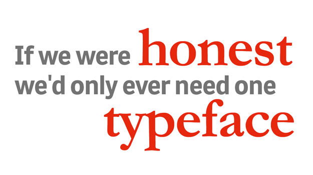
The way something looks has a profound effect on how we understand and process the information it holds. Advertising, packaging and information design has been exploiting this for decades. No matter how much we information designers strive for neutrality, we can’t escape giving information a particular voice when we design it. Neville Brody may have been being ironic when he said: “If we were honest we’d only ever need one typeface.” But that realization that every typeface and every design decision carries with it a motive and ultimately an implication on how a piece of information is understood is more relevant today than ever.
The ‘design voice’ of a piece of information varies depending on the stylistic whims of the times and the viewer’s level of visual literacy. Both of these are framed by current cultural trends and the viewer’s historic cultural understanding. The understanding I personally have of aesthetics is framed by my western upbringing. The modernism, white space and ‘clean lines’ I love and think of as a clear authoritative design voice is a western cultural construct. When it comes to internationalization and localization, just porting a design from one culture to another is unlikely to be effective. Often it will under-perform and in some cases even miscommunicate.
The thing is, it’s not just the big things like how in Eastern societies people are more likely to rely on holistic reasoning than in the West, where analytic reasoning is move prevalent. As studies have shown, this can effect not only the mental models we have to help us organize and categorize the world, but even the way we perceive it. Or how about the fact that even our spatial understanding of time is not globally shared. In English, time flows from left to right – thanks primarily to our written word. In some other societies time flows from top to bottom (again referencing their written word) and in others it’s more closely linked to the passage of the sun or the cardinal directions.
It’s also the little things that catch us. Even the basic building blocks of a designer’s toolkit can be complex little beasts just waiting to turn and bite you. Whether that’s the availability of a typeface, and as Errol Morris in the New York Times online showed us, that can have a huge impact on a reader’s likeliness to believe or trust a piece of information. Right on down to the colors we naturally reach for when we want to express loss or growth or love or festivity. There is rarely a one choice that fits for everyone. The most common example of color tripping up information designers is in finance. For western stock exchanges and money markets the index grids and price tables often use red for negative, meaning loss, and green for positive, meaning growth. However in China it’s the opposite. Red for growth and green for loss. Red in Chinese culture signifies good fortune and financial prosperity.
As with all design and communication, in the end it’s all about people; knowing them, what motivates them, what frames their activities and what they understand.
There’s an old marketing anecdote about the Coca-Cola executive that tries to communicate the benefits of their drink in Saudi Arabia. He lacks Arabic language skills so he decides to convey the benefits as a pictorial story laid out through three posters, like so:

But no one told him that Arabic is read right to left.
So when porting that dashboard to the next market, take the time to test it with the locals – as the things we find second nature are always the ones to catch us.